Film & TV Work

Movie
The Accused
Year
2024
Synopsis:
A dedicated and community minded scientist finds herself drawn into a web of danger and deceit, when she is wrongly accused in the death of her fiancée. On the road to proving her innocence, she uncovers a sinister conspiracy linked to a powerful biopharmaceutical company. As the secrets unfold and threats multiply, she must navigate treacherous waters in order to protect the community she loves and expose the truth in order to clear her name.
Logo Design - Iterative work process based on current movies and action movie research.


Squad Car Decals


Banner - Set: Children’s Community Center

Posters - Set: Children’s Community Center


Certificate’s & Gak - Various Sets


Props - Set: Veredent Labs


Film & TV
- Time Period
Project
1970’s Ads
Year
2024
These posters were made thinking about a 1970’s bar scene where they could be hanging in the background. Car and beer campaigns were highly designed and distributed at that time. Many of these advertisements helped make iconic brands what they are today. Michelob has a campaign which pitched their beer as the sporty, outdoorsy one you would want to drink on a summers day. To keep it in the time period, I used their ‘surprise people’ slogan and iconic beer bottles of the 70’s along with the swimming pool to keep it on brand with the sporty campaign. The Plymouth ads were very descriptive of the functionalities of their cars while remaining minimalistic and sleek. All assets within both posters were taken from real ads and then edited in Photoshop and Illustrator.


Project
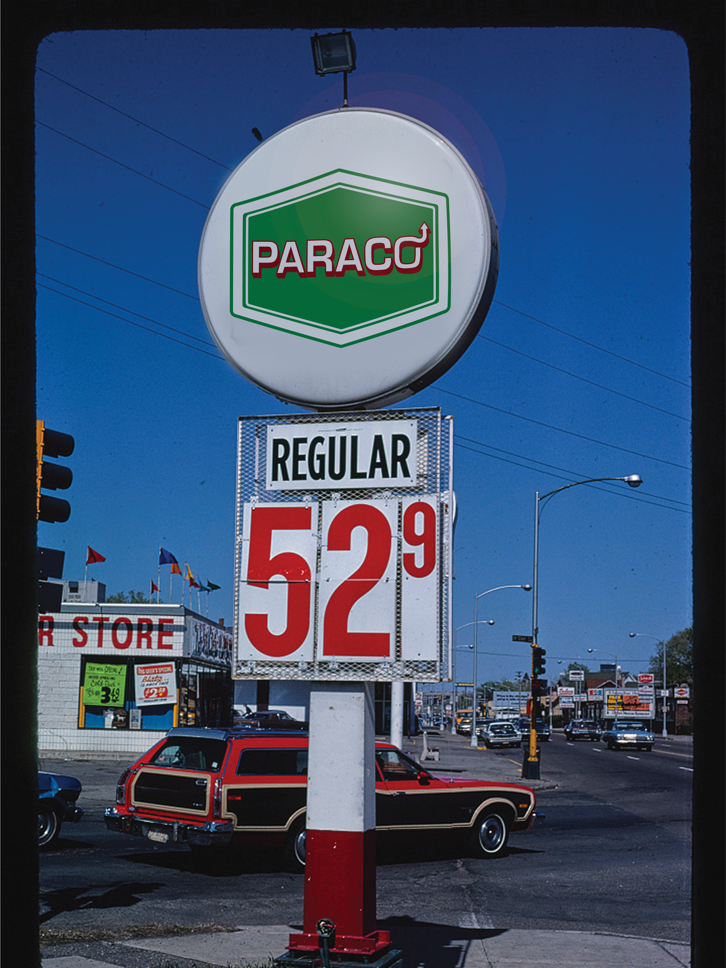
Fuel Logo & Signage
Year
2024
For this I reimagined a 1980’s gas logo and branding. I did research on what gas stations were looking like at this time and got to work creating a name, logo, and finally colors that seemed to fit the time. The name Paraco comes from ‘para’ or getting prepared and the ‘co’ comes from ‘company’ as many gas brands such as Sunoco or Texaco. Using a container shape to encase the type in helps to give it the feel of a real gas company logo. To keep it authentic to the time I decided to go with a burgundy and forest green color because they were so popular in the 80’s.


On a show or movie if this sign needed to be fabricated and put into a Lightbox I would be sure we had a printer or vendor that was able to print a design this large. Once that is established a translucent paper could be used to print onto such as an acetate or Lightbox specific paper.